CSS 基础
取值单位
外观样式
布局样式
动画样式
工具与规范
实例练习
前言
弹性盒子(Flexible Box,通常简称为 flexbox)布局是一种一维的布局模型。它的主要特点是给子元素提供了强大的空间分布和对齐能力。
$$tip
flex 布局已被浏览器全面支持,加上其强大的布局能力,现在网络上技术栈较新的网站都大量采用 flex 布局。比如:b 站、知乎等等。因此对于 flex 的知识点要求熟练掌握。
$$
基础概念和术语
由于 flexbox 是一个整套布局方案的代称,并不单指某个样式属性。整个方案里面会涉及到很多东西,先通过下图进行理解有助于之后的学习。
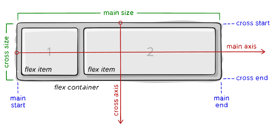
- 容器(flex container):容纳所有 flex 子项的父元素被称为 flex 容器,容器的 display 样式为 flex 或 inline-flex。
- 子项(flex item):容器的第一级子元素,会被进行分布或排列对齐。
- 主轴(main axis):子项排列的轴向被称为主轴。
- 交叉轴(cross axis):与主轴垂直的轴向被称为交叉轴。
- 主轴长度(main size):主轴的长度。
- 交叉轴长度(cross size):交叉轴的长度。
Flexbox 布局讲解
在以下的例子中,我们创建了一个 flex 容器,而且没有添加任何属性配置。它有着三个子项,这些子项安静地排成了一行。这便是一个最简单的 flex 布局,以下学习的所有属性配置不过是调整子项的排列对齐方式。
$$tip
块级元素作为 flex 子项时宽度会等于内容的宽度。
$$
<iframe height="300" style="width: 100%" scrolling="no" title="flexbox" src="https://codepen.io/3yya/embed/ZEabGdz?default-tab=html%2Cresult&editable=true&theme-id=light" frameborder="no" loading="lazy" allowtransparency="true" allowfullscreen="true"></iframe>
常用场景
垂直居中
垂直居中是一个很常见的应用,参见登录框垂直对齐实例。同时元素垂直居中一直是一个难点,而弹性盒子的出现很轻松地解决了这个问题。
以下实例中设置容器的 align-items: center 使得子项在交叉轴上居中。
<div class="container">
    <div class="box"></div>
</div>
<style>
    .container {
        height: 200px;
        background-color: pink;
        display: flex;
        align-items: center;
    }

    .box {
        width: 50px;
        height: 50px;
        background-color: teal;
    }
</style>
$$demo
<div class="container">
<div class="box"></div>
</div>
<style>
.container {
height: 200px;
background-color: pink;
display: flex;
align-items: center;
}
.box {
width: 50px;
height: 50px;
background-color: teal;
}
</style>
$$
垂直居中对齐
之前的代码中都是设置待对齐元素 vertical-align: middle; 的方式对行内元素实现垂直居中对齐,略显麻烦。
以下实例中设置容器的 align-items: center 使得子项在交叉轴上居中。
<div class="container">
    <div class="box"></div>
    <div class="box2"></div>
    <div class="box3"></div>
</div>
<style>
    .container {
        height: 200px;
        background-color: pink;
        display: flex;
        align-items: center;
    }

    .box {
        width: 50px;
        height: 50px;
        background-color: teal;
    }
    .box2 {
        width: 100px;
        height: 150px;
        background-color: green;
    }
    .box3 {
        width: 80px;
        height: 100px;
        background-color: yellow;
    }
</style>
$$demo
<div class="container">
<div class="box"></div>
<div class="box2"></div>
<div class="box3"></div>
</div>
<style>
.container {
height: 200px;
background-color: pink;
display: flex;
align-items: center;
}
.box {
width: 50px;
height: 50px;
background-color: teal;
}
.box2 {
width: 100px;
height: 150px;
background-color: green;
}
.box3 {
width: 80px;
height: 100px;
background-color: yellow;
}
</style>
$$
水平居中
在之前经常使用以下方式对元素水平居中:
- 行内元素:父元素设置
text-align: center; - 块级元素:设置
margin: 0 auto;
现在则有了以下的方式,通过设置容器的 justify-content: center 可以让子项在主轴上居中排列。
$$tip
flex-direction: row 时主轴为水平方向, flex-direction: column 时主轴为垂直方向。 $$
<div class="container">
    <div class="box"></div>
    <div class="box2"></div>
</div>
<style>
    .container {
        background-color: pink;
        display: flex;
        justify-content: center;
    }

    .box {
        width: 50px;
        height: 50px;
        background-color: teal;
    }
    .box2 {
        width: 100px;
        height: 50px;
        background-color: yellow;
    }
</style>
$$demo
<div class="container">
<div class="box"></div>
<div class="box2"></div>
</div>
<style>
.container {
background-color: pink;
display: flex;
justify-content: center;
}
.box {
width: 50px;
height: 50px;
background-color: teal;
}
.box2 {
width: 100px;
height: 50px;
background-color: yellow;
}
</style>
$$
两端对齐
两端对齐是最常见的场景之一,导航栏经常就是两端对齐, 参见一个导航栏两端对齐的实例。一个之前介绍过使用 float 实现两端对齐的方式,但使用 flex 实现起来将会更加优雅。
以下通过设置容器的 justify-content: space-between 使其实现了主轴两端对齐。
<div class="container">
    <div class="box"></div>
    <div class="box2"></div>
</div>
<style>
    .container {
        background-color: pink;
        display: flex;
        justify-content: space-between;
    }

    .box {
        width: 50px;
        height: 50px;
        background-color: teal;
    }
    .box2 {
        width: 100px;
        height: 50px;
        background-color: teal;
    }
</style>
$$demo
<div class="container">
<div class="box"></div>
<div class="box2"></div>
</div>
<style>
.container {
background-color: pink;
display: flex;
justify-content: space-between;
}
.box {
width: 50px;
height: 50px;
background-color: teal;
}
.box2 {
width: 100px;
height: 50px;
background-color: teal;
}
</style>
$$
弹性伸缩
有时需要某个元素占满剩余的空间,比如这个弹性搜索框实例。
<div class="container">
    <div class="box"></div>
    <div class="flex-box"></div>
    <div class="box2"></div>
</div>
<style>
    .container {
        display: flex;
    }

    .box {
        width: 50px;
        height: 50px;
        background-color: teal;
    }
    .flex-box {
        flex: 1;
        background-color: yellow;
    }
    .box2 {
        width: 100px;
        height: 50px;
        background-color: teal;
    }
</style>
$$demo
<div class="container">
<div class="box"></div>
<div class="flex-box"></div>
<div class="box2"></div>
</div>
<style>
.container {
display: flex;
}
.box {
width: 50px;
height: 50px;
background-color: teal;
}
.flex-box {
flex: 1;
background-color: yellow;
}
.box2 {
width: 100px;
height: 50px;
background-color: teal;
}
</style>
$$
容器属性
容器属性部分包括了所有跟 flex 有关的作用于容器的属性样式。
display
定义 flex 容器。
- flex:定义元素为弹性盒子容器。
- inline-flex:定义元素为行内弹性盒子容器。
$$tip
flex 与块级元素类似,特性如下:
- 默认占满父元素内容区域。
- 独占一行。
inline-flex 与行内块元素类似,特性如下:
- 默认宽度为内容宽度。
- 可与其他行内元素共处一行。
$$
修改以下样例的 display 属性,观察下窗口背景色的宽度理解它们的区别。
<iframe height="300" style="width: 100%" scrolling="no" title="flexbox" src="https://codepen.io/3yya/embed/MWOaaZb?default-tab=css%2Cresult&editable=true&theme-id=light" frameborder="no" loading="lazy" allowtransparency="true" allowfullscreen="true"></iframe>
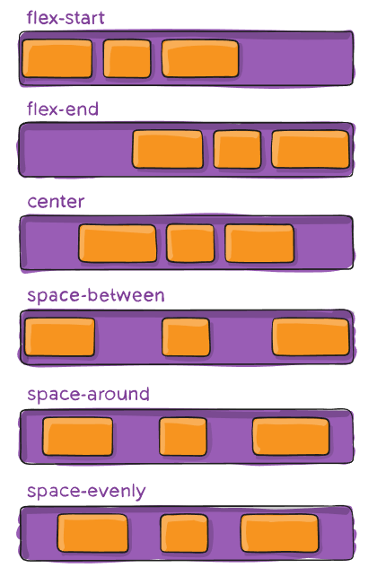
justify-content
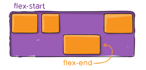
定义了子项沿主轴的对齐方式,有以下常用属性值:
- flex-start(默认):起始线对齐。
- flex-end:终止线对齐。
- center:居中对齐。
- space-between:子项均匀分布,两端对齐。
- space-around:子项均匀分布,两端间距与其余间距一半。
- space-evenly:子项均匀分布,两端间距为其余间距一致。
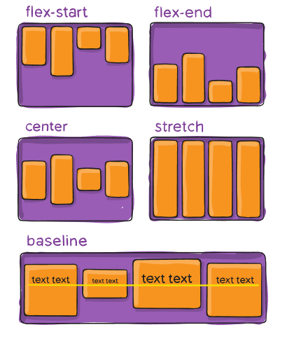
align-items
定义子项在交叉轴上的对齐方式,有以下取值:
- stretch:默认值,未设置尺寸的元素将被拉伸至交叉轴长度(cross size)。
- flex-start:交叉轴开始处(cross start)对齐。
- flex-end:交叉轴结束处(cross end)对齐。
- center:交叉轴中部对齐。
- baseline:交叉轴上基线对齐。
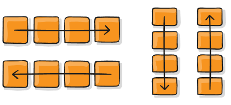
flex-direction
决定了主轴的方向。
- row(默认):水平方向。
- row-reverse:水平方向,反向。
- column:垂直方向。
- column-reverse:垂直方向,反向。
以下实例设置了 flex-direction 为 row-reverse ,可见子项元素是从右至左排列的。试着修改
flex-direction 为其他值看看效果。
<iframe height="300" style="width: 100%" scrolling="no" title="flexbox" src="https://codepen.io/3yya/embed/WNXQQBQ?default-tab=css%2Cresult&editable=true&theme-id=light" frameborder="no" loading="lazy" allowtransparency="true" allowfullscreen="true"></iframe>
flex-wrap
定义子项目在超过一行时是否换行。
- nowrap(默认值):不换行。
- wrap:子项将会换行,从上至下。
- wrap-reverse:子项将会换行,从下至上。
以下实例将 flex-wrap 设置为 wrap-reverse ,可以看到是从下至往上排列。
<iframe height="300" style="width: 100%" scrolling="no" title="flexbox" src="https://codepen.io/3yya/embed/dyZYGNa?default-tab=css%2Cresult&editable=true&theme-id=light" frameborder="no" loading="lazy" allowtransparency="true" allowfullscreen="true"></iframe>
flex-flow
为 flex-direction 和 flex-wrap 的合并写法。
例: flex-flow: column wrap;
gap
定义了子项的间距。
<div class="container">
    <div class="item">a</div>
    <div class="item">b</div>
    <div class="item">c</div>
    <div class="item">d</div>
    <div class="item">e</div>
    <div class="item">f</div>
    <div class="item">g</div>
</div>
<style>
    .container {
        display: flex;
        background-color: #ccc;

        max-width: 300px;
        flex-wrap: wrap;

        /* 子项的间距 */
        gap: 20px;
    }
    .item {
        background-color: #048888;
        padding: 10px 20px;
        color: white;
        font-size: 20px;
        font-weight: bold;
    }
</style>
$$demo
<div class="container"> <div class="item">a</div> <div class="item">b</div> <div class="item">c</div> <div class="item">d</div> <div class="item">e</div> <div class="item">f</div> <div class="item">g</div> </div> <style> .container { display: flex; background-color: #ccc;
    max-width: 300px;
    flex-wrap: wrap;

    /* 子项的间距 */
    gap: 20px;
}
.item {
    background-color: #048888;
    padding: 10px 20px;
    color: white;
    font-size: 20px;
    font-weight: bold;
}
</style>
$$
子项属性
order
默认情况下,子项顺序按照元素的顺序排列,也可以用 order 改变它们的顺序。默认子项的 order 为 0,按从小到大的顺序排序。
<iframe height="300" style="width: 100%" scrolling="no" title="flexbox" src="https://codepen.io/3yya/embed/xxPwVpb?default-tab=css%2Cresult&editable=true&theme-id=light" frameborder="no" loading="lazy" allowtransparency="true" allowfullscreen="true"></iframe>
flex-grow
定义子项的弹性增长权重,决定了在主轴上存在剩余空间时,子项增长的权重系数,默认值为 0。
计算公式:
元素长度 = 设定长度 + 增长长度
增长长度 = 剩余长度 * 权重占比
权重占比 = 自身权重 / 总权重
自身权重 = flex-grow
得到:元素长度 = 设定长度 + 剩余长度 * flex-grow / 总权重
假设:存在 a、b 两个子项目,主轴空间剩余 100px。

a:
flex-grow:3;
width: 100px;
总权重 = 3 + 1(b 的权重)= 4
权重占比 = 3/4
元素长度 = 100px(设定长度)+ 100px(剩余长度)* 3/4(权重占比) = 175px

b:
flex-grow:1;
width: 200px;
总权重 = 1 + 3(a 的权重)= 4
权重占比 = 1/4
元素长度 = 200px(设定长度)+ 100px(剩余长度)* 1/4(权重占比) = 225px
<div class="container">
    <div class="a"></div>
    <div class="b"></div>
</div>
<style>
    .container {
        display: flex;
        width: 400px;
        height: 100px;
        background-color: gray;
    }
    .a {
        width: 100px;
        background-color: yellow;
        flex-grow: 3;
    }
    .b {
        width: 200px;
        background-color: teal;
        flex-grow: 1;
    }
</style>
$$demo
<div class="container">
<div class="a"></div>
<div class="b"></div>
</div>
<style>
.container {
display: flex;
width: 400px;
height: 100px;
background-color: gray;
}
.a {
width: 100px;
background-color: yellow;
flex-grow: 3;
}
.b {
width: 200px;
background-color: teal;
flex-grow: 1;
}
</style>
$$
flex-shrink
定义子项的弹性收缩权重,决定了在主轴上发生溢出时,子项收缩的权重系数,默认值为 1 。与 flex-grow 不同的是,权重的计算还与自身设定的长度有关。
计算公式:
元素长度 = 设定长度 - 收缩长度
收缩长度 = 溢出长度 * 权重占比
权重占比 = 自身权重 / 总权重
自身权重 = 设定长度 * flex-shrink
得到:元素长度 = 设定长度 - 溢出长度 * (设定长度 * flex-shrink)/ 总权重
假设:存在 a、b 两个子项目,主轴空间溢出 100px。

a:
flex-shrink:6;
width:100px;
自身权重 = 100(设定长度)*  6(flex-shrink)= 600
总权重 = 600 + 400(b 的权重)= 1000
权重占比 = 600 / 1000 = 3/5
元素长度 = 100px(设定长度) - 100px(溢出长度) * 3/5(权重占比) = 40px

b:
flex-shrink:1;
width:400px;
自身权重 = 400(设定长度)*  1(flex-shrink)= 400
总权重 = 400 + 600(a 的权重)= 1000
权重占比 = 400 / 1000 = 2/5
元素长度 = 400px(设定长度) - 100px(溢出长度) * 2/5(权重占比) = 360px
<div class="container">
    <div class="a"></div>
    <div class="b"></div>
</div>
<style>
    .container {
        display: flex;
        width: 400px;
        height: 100px;
        background-color: gray;
    }
    .a {
        width: 100px;
        background-color: yellow;
        flex-shrink: 6;
    }
    .b {
        width: 400px;
        background-color: teal;
        flex-shrink: 1;
    }
</style>
$$demo
<div class="container">
<div class="a"></div>
<div class="b"></div>
</div>
<style>
.container {
display: flex;
width: 400px;
height: 100px;
background-color: gray;
}
.a {
width: 100px;
background-color: yellow;
flex-shrink: 6;
}
.b {
width: 400px;
background-color: teal;
flex-shrink: 1;
}
</style>
$$
$$warning
默认情况下 flex-shrink 不能收缩小于内容于主轴上的长度。如果要使其收缩小于内容的长度,需要设置以下值:
min-width: 0(主轴为水平方向时)min-height: 0(主轴为垂直方向时)overflow: hidden(或任何其他值,除了visible)
参考资料:Why don't flex items shrink past content size?
$$
<iframe height="300" style="width: 100%" scrolling="no" title="flexbox" src="https://codepen.io/3yya/embed/jOYbJJG?default-tab=css%2Cresult&editable=true&theme-id=light" frameborder="no" loading="lazy" allowtransparency="true" allowfullscreen="true"></iframe>
flex-basis
定义了子项在主轴上的默认大小,当主轴是水平方向时 flex-basis 约等于 width , 当主轴是垂直方向时 flex-basis 约等于 height 。
flex
flex-grow 、 flex-shrink 、 flex-basis 的组合写法。默认值为 0 1 auto 。
align-self
定义单个子项的对齐方式,有以下取值:
- auto:默认值,跟随容器
align-items的定义。 - flex-start:交叉轴开始处(cross start)对齐。
- flex-end:交叉轴结束处(cross end)对齐。
- center:交叉轴中部对齐。
- baseline:交叉轴上基线对齐。
练习
- 试着让登录框实例水平垂直居中,查看演示效果。 $$answer
<!DOCTYPE html>
<html>
    <head>
        <meta charset="UTF-8" />
        <meta http-equiv="X-UA-Compatible" content="IE=edge" />
        <meta name="viewport" content="width=device-width, initial-scale=1.0" />
        <link rel="shortcut icon" type="image/x-icon" href="/logo-mini.png" />
        <title>登录框垂直居中</title>
        <style>
            :root {
                box-sizing: border-box;
            }
            *,
            *::before,
            *::after {
                box-sizing: inherit;
            }
            body {
                display: flex;
                justify-content: center;
                align-items: center;
                margin: 0;
                height: 100vh;
            }
            .box {
                text-align: center;
                width: 400px;
                border-radius: 14px;
                background-color: pink;
                border: 3px #65336e solid;
            }
            .title {
                font-size: 34px;
                font-weight: bold;
                color: white;
                border-radius: 11px 11px 0 0;
                padding: 20px 0;
                background-color: teal;
                margin-bottom: 20px;
            }
            .label {
                background: #eee;
                width: 70px;
                display: inline-block;
                border-radius: 3px 0 0 3px;
                height: 40px;
                line-height: 40px;
                vertical-align: middle;
                font-size: 14px;
                color: white;
                background-color: teal;
                font-weight: bold;
            }
            .username,
            .password {
                height: 40px;
                border: none;
                padding: 0;
                vertical-align: middle;
                border-radius: 0 3px 3px 0;
                padding: 0 10px;
            }
            .row,
            .login-btn {
                margin-bottom: 20px;
            }
            .login-btn {
                cursor: pointer;
                padding: 5px 30px;
                border: 3px #65336e solid;
                border-radius: 4px;
                background-color: #ffdb8a;
                color: #65336e;
                font-weight: bold;
                font-size: 22px;
            }
            .login-btn:hover {
                background-color: #fff0ce;
            }
            .login-btn:active {
                background-color: #fdcc59;
            }
            .username:focus,
            .password:focus {
                outline: none;
            }
        </style>
    </head>
    <body>
        <div class="box">
            <div class="title">登录页面</div>
            <div class="row">
                <label for="username" class="label">用户名</label
                ><input
                    id="username"
                    class="username"
                    type="text"
                    placeholder="请输入用户名"
                />
            </div>
            <div class="row">
                <label for="password" class="label">密码</label
                ><input
                    id="password"
                    class="password"
                    type="password"
                    placeholder="请输入密码"
                />
            </div>
            <button class="login-btn">登录</button>
        </div>
    </body>
</html>
$$
- 试着让导航栏实例两端对齐,查看演示效果。 $$answer
<!DOCTYPE html>
<html>
    <head>
        <meta charset="UTF-8" />
        <meta http-equiv="X-UA-Compatible" content="IE=edge" />
        <meta name="viewport" content="width=device-width, initial-scale=1.0" />
        <link rel="shortcut icon" type="image/x-icon" href="/logo-mini.png" />
        <title>导航栏两端对齐</title>

        <style>
            :root {
                box-sizing: border-box; /* 设置根元素的 box-sizing: border-box */
            }
            *,
            *:before,
            *:after {
                box-sizing: inherit; /* box-sizing 继承自父元素 */
            }

            body {
                margin: 0;
            }

            .navigator {
                height: 60px;
                box-shadow: 0 0 4px #999;

                padding: 0 40px;

                display: flex;
                justify-content: space-between;

                align-items: center;
            }

            .navigator a {
                text-decoration: none;
                color: inherit;
            }

            .brand {
                display: flex;
                align-items: center;
            }

            .logo {
                height: 40px;
            }

            .name {
                font-size: 20px;
            }

            .route {
                position: relative;
            }

            .route > a {
                padding: 10px 25px;
                border-radius: 4px;
                cursor: pointer;
            }
            .route:hover > a {
                background-color: #eee;
            }

            .route .container {
                padding-top: 15px;
                top: 30px;
                left: 0;
                display: none;
                position: absolute;
                font-size: 14px;
                /* background-color: red; */
            }
            .route:hover .container {
                display: block;
            }

            .route .container ul {
                list-style: none;
                margin: 0;
                padding: 0;
                box-shadow: 0 0 4px #999;
                background-color: white;
                border-radius: 4px;
            }

            .route .container li {
                cursor: pointer;
            }
            .route .container li:hover {
                background-color: #eee;
            }

            .route .container li a {
                display: inline-block;
                padding: 10px;
                min-width: 140px;
            }
        </style>
    </head>
    <body>
        <header class="navigator">
            <div class="brand">
                <img
                    class="logo"
                    src="https://3yya.com/logo-mini.png"
                    alt="logo"
                />
                <h3 class="name">三眼鸭编程</h3>
            </div>
            <div class="routes">
                <span class="route">
                    <a href="https://3yya.com/" target="_blank">首页</a>
                </span>
                <span class="route">
                    <a href="https://3yya.com/" target="_blank">教程</a>
                    <div class="container">
                        <ul>
                            <li>
                                <a
                                    href="https://3yya.com/course/2"
                                    target="_blank"
                                    >Python</a
                                >
                            </li>
                            <li>
                                <a
                                    href="https://3yya.com/course/3"
                                    target="_blank"
                                    >设计模式</a
                                >
                            </li>
                            <li>
                                <a
                                    href="https://3yya.com/course/9"
                                    target="_blank"
                                    >爬虫</a
                                >
                            </li>
                        </ul>
                    </div>
                </span>
                <span class="route">
                    <a href="https://3yya.com/courseware" target="_blank"
                        >教材</a
                    >
                    <div class="container">
                        <ul>
                            <li>
                                <a
                                    href="https://3yya.com/courseware/chapter/30"
                                    target="_blank"
                                    >前端课</a
                                >
                            </li>
                            <li>
                                <a
                                    href="https://3yya.com/courseware/chapter/32"
                                    target="_blank"
                                    >HTML</a
                                >
                            </li>
                            <li>
                                <a
                                    href="https://3yya.com/courseware/chapter/43"
                                    target="_blank"
                                    >CSS</a
                                >
                            </li>
                        </ul>
                    </div>
                </span>
            </div>
        </header>
    </body>
</html>
$$
- 试着写一个弹性伸缩的搜索框,查看演示效果。 $$answer
<!DOCTYPE html>
<html>
    <head>
        <meta charset="UTF-8" />
        <meta http-equiv="X-UA-Compatible" content="IE=edge" />
        <meta name="viewport" content="width=device-width, initial-scale=1.0" />
        <link rel="shortcut icon" type="image/x-icon" href="/logo-mini.png" />
        <title>导航栏两端对齐</title>

        <style>
            :root {
                box-sizing: border-box; /* 设置根元素的 box-sizing: border-box */
            }
            *,
            *:before,
            *:after {
                box-sizing: inherit; /* box-sizing 继承自父元素 */
            }

            body {
                margin: 0;
            }

            .navigator {
                height: 60px;
                text-align: center;
                line-height: 60px;
                /* border-bottom: 1px solid #eee; */
                box-shadow: 0 0 4px #999;

                padding: 0 20px;

                display: flex;
                justify-content: space-between;
                align-items: center;

                gap: 80px;
            }

            .brand {
                /* 作为容器的属性 */
                display: flex;
                align-items: center;

                /* 作为子项的属性 */
                /* 防止被压缩 */
                flex-shrink: 0;
            }

            .routes {
                /* 作为子项的属性 */
                /* 防止被压缩 */
                flex-shrink: 0;
            }

            .search {
                height: 40px;
                flex: 1;
                border-radius: 20px;
                padding: 20px;
                border: none;
                outline: none;
                background-color: #eee;
            }

            .navigator a {
                text-decoration: none;
                color: inherit;
            }

            .logo {
                height: 40px;
            }

            .name {
                font-size: 20px;
            }

            .route {
                position: relative;
                /* margin-right: 10px; */
            }

            .route > a {
                padding: 10px 25px;
                border-radius: 4px;
                cursor: pointer;
            }
            .route:hover > a {
                background-color: #eee;
            }

            .route .container {
                padding-top: 15px;
                top: 30px;
                left: 0;
                display: none;
                position: absolute;
                font-size: 14px;
                /* background-color: red; */
            }
            .route:hover .container {
                display: block;
            }

            .route .container ul {
                line-height: initial;
                text-align: initial;
                list-style: none;
                margin: 0;
                padding: 0;
                box-shadow: 0 0 4px #999;
                background-color: white;
                border-radius: 4px;
            }

            .route .container li {
                cursor: pointer;
            }
            .route .container li:hover {
                background-color: #eee;
            }

            .route .container li a {
                display: inline-block;
                padding: 10px;
                min-width: 140px;
            }
        </style>
    </head>
    <body>
        <header class="navigator">
            <div class="brand">
                <img
                    class="logo"
                    src="https://3yya.com/logo-mini.png"
                    alt="logo"
                />
                <h3 class="name">三眼鸭编程</h3>
            </div>
            <input
                class="search"
                type="text"
                placeholder="输入你想搜索的内容"
            />
            <div class="routes">
                <span class="route">
                    <a href="https://3yya.com/" target="_blank">首页</a>
                </span>
                <span class="route">
                    <a href="https://3yya.com/" target="_blank">教程</a>
                    <div class="container">
                        <ul>
                            <li>
                                <a
                                    href="https://3yya.com/course/2"
                                    target="_blank"
                                    >Python</a
                                >
                            </li>
                            <li>
                                <a
                                    href="https://3yya.com/course/3"
                                    target="_blank"
                                    >设计模式</a
                                >
                            </li>
                            <li>
                                <a
                                    href="https://3yya.com/course/9"
                                    target="_blank"
                                    >爬虫</a
                                >
                            </li>
                        </ul>
                    </div>
                </span>
                <span class="route">
                    <a href="https://3yya.com/courseware" target="_blank"
                        >教材</a
                    >
                    <div class="container">
                        <ul>
                            <li>
                                <a
                                    href="https://3yya.com/courseware/chapter/30"
                                    target="_blank"
                                    >前端课</a
                                >
                            </li>
                            <li>
                                <a
                                    href="https://3yya.com/courseware/chapter/32"
                                    target="_blank"
                                    >HTML</a
                                >
                            </li>
                            <li>
                                <a
                                    href="https://3yya.com/courseware/chapter/43"
                                    target="_blank"
                                    >CSS</a
                                >
                            </li>
                        </ul>
                    </div>
                </span>
            </div>
        </header>
    </body>
</html>
$$
- 试着写一个后台布局,查看演示效果。 $$answer
<!DOCTYPE html>
<html>
    <head>
        <meta charset="UTF-8" />
        <meta http-equiv="X-UA-Compatible" content="IE=edge" />
        <meta name="viewport" content="width=device-width, initial-scale=1.0" />
        <link rel="shortcut icon" type="image/x-icon" href="/logo-mini.png" />
        <title>管理后台</title>
        <style>
            :root {
                box-sizing: border-box; /* 设置根元素的 box-sizing: border-box */
            }
            *,
            *:before,
            *:after {
                box-sizing: inherit; /* box-sizing 继承自父元素 */
            }
            body {
                margin: 0;
            }
            .container {
                height: 100vh;
                display: flex;
                flex-direction: column;
            }
            .header {
                background-color: #2e313a;
                padding: 0 20px;
                height: 30px;

                color: white;
                font-size: 14px;
                font-weight: bold;

                display: flex;
                justify-content: space-between;
                align-items: center;
            }
            .name {
                color: yellow;
            }
            .content {
                display: flex;
                flex: 1;
            }
            .navigator {
                width: 200px;
                background-color: #393d49;
                flex-shrink: 0;
                overflow: auto;
            }
            .main {
                flex: 1;
            }
            .brand {
                color: #bbb;
                text-align: center;
                font-size: 48px;
                font-weight: bold;
            }
            .navigator ul {
                list-style: none;

                padding: 0;
                margin: 0;

                color: white;
                font-size: 15px;
            }
            .navigator li {
                padding: 20px;
                cursor: pointer;
            }
            .navigator li:hover {
                background-color: #2e313a;
            }
            .navigator .online {
                background-color: teal;
            }
        </style>
    </head>
    <body>
        <div class="container">
            <header class="header">
                <span>三眼鸭编程</span>
                <span>
                    <span>管理员:</span>
                    <span class="name">三眼鸭</span>
                </span>
            </header>
            <div class="content">
                <aside class="navigator">
                    <ul>
                        <li class="online">首页</li>
                        <li>帖子</li>
                        <li>用户</li>
                        <li>管理</li>
                    </ul>
                </aside>
                <main class="main">
                    <h1 class="brand">三眼鸭编程</h1>
                </main>
            </div>
        </div>
    </body>
</html>
$$